The added value of Time Location Charts


Linear Scheduling Method (LSM) is used mainly to schedule resources in repetitive activities commonly found in linear construction projects, such as:
- Road infrastructure (highways, tunnels, bridges...)
- Pipeline
- High-rise buildings
- Rail construction
- Offshore windfarms
Linear scheduling utilizes Time Location Charts (also known as Time Distance Diagrams) as an alternative to present schedules instead of classic Gantt charts. The figure below shows a simple schedule in a Gantt chart and Time Location Chart of a 3-story building construction project.
The difference between the Gantt Chart and the Time location Chart is illustrated below. In contrast to the Gantt Chart, the latter one projects time on the Y-axis.

Gantt Chart:
- X-axis: Time
- Y-axis: WBS

Time Location Chart:
- X-axis: Location
- Y-axis: Time
Added value of Time Location Charts
Schedule Visualization
As a project scheduler or project controls expert, one of your tasks is to inform the various members of the project team (management/experts/team leads/...).
Communication and representation of the data are essential.
When working in a complex project environment, you are often confronted with large and complicated schedules. All this data can be printed out in hundreds of classic Gantt chart pages when working with your scheduling software (p.e. Oracle Primavera P6). Using suitable filters can put the focus on some parts or details of the project schedule. This is already a widely known and used feature in P6.
Great, but what if you want to make your whole schedule visible?
Do you want to give your colleagues a headache by forwarding a whole book of Gantt charts?
Of course, you don’t...
You want to bring added value to the team. You can do this by putting effort into your presentation of the project schedule, so your audience understands the logic of your schedule.
Time Location Charts can be a great added value to your skill set in this field.

Besides visualizing your schedule on one page, Time Location Charts have other advantages as well: it is readable for everyone and gives extra insights into the schedule.
Added value of Time Location Charts
Schedule Visualization
As a project scheduler or project controls expert, one of your tasks is to inform the various members of the project team (management/experts/team leads/...).
Communication and representation of the data are essential.
When working in a complex project environment, you are often confronted with large and complicated schedules. All this data can be printed out in hundreds of classic Gantt chart pages when working with your scheduling software (p.e. Oracle Primavera P6). Using suitable filters can put the focus on some parts or details of the project schedule. This is already a widely known and used feature in P6.
Great, but what if you want to make your whole schedule visible?
Do you want to give your colleagues a headache by forwarding a whole book of Gantt charts?
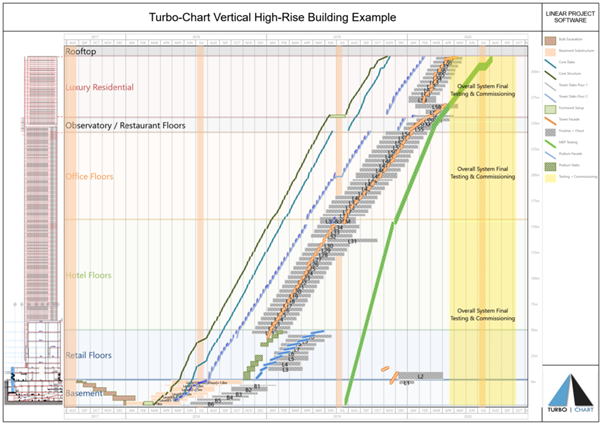
Time Location Chart (Source: www.Turbo-chart.com)
Linear Scheduling Software
Across construction management Tilos (Time Location Software) has become a term synonymous with linear scheduling. It is often (mistakenly) considered to be the only option when Linear Scheduling or Time Location Charting is required.
Turbo-Chart is an alternative for the creation of Time Location Charts.

Tilos |
Turbo Chart |
|
|
Conclusion
Time Location Charts are an excellent asset to your project scheduling skill set.
You can try it out on a small part of your project and see if it brings added value to the team.
Either way, it will be a refreshing, very intuitive, and appealing presentation of the schedule.
Feel free to contact our experts to discuss your Time Location Creations!