
24 Oct 2023
The value of integrated cost risk analysis


A schedule risk analysis is a powerful tool to gain insight into the influence of risks and uncertainties on the cost and duration of a project.
Rijkswaterstaat has included the probabilistic planning in its PPI method [1], a method that is increasingly being adopted by other clients and contractors. According to this method, the top risks are determined by risks that have a maximum influence on the feasibility of the schedule. To identify these top risks, the tornado diagrams duration sensitivity and cruciality are used. In this blog we will discuss whether this is the most intuitively understandable, and more importantly, the correct way to identify top risks. We consider the possible bias of these charts and suggest a simpler and better alternative.
A schedule risk analysis
A schedule risk analysis uses Monte Carlo simulation. A network is calculated several times,
with each time certain risks included or excluded. In this way, the impacts of risks on the project objectives can be analysed.
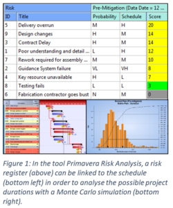
An important output, which is asked by Rijkswaterstaat in the PPI method, is when you can say with 80% certainty, on which date the project can be delivered on time. This date is given by the distribution of possible end dates from the output of the simulation (bottom right Fig. 1).
Another important output of the schedule risk analysis is that the top risks are identified. These are the risks that have the largest impact on the project objectives. In this blog we will focus on the duration of the project.
We will use the example project ExampleRegister-Rocket.plan, as available in the software tool Primavera Risk Analysis.
Tornado diagrams
To identify the top risks, tornado diagrams are used. These are bar charts with the most important risk at the top, and the least important at the bottom. At least, that's the intention. Tornado graphs exist in different flavours, including:
What are top risks?
The tornado charts are used to identify the top risks. But do they what we want? If we look at the impact on time, how would we define top risks?
Top risks are risks that have the greatest impact on the duration of the project. For the prioritization of risks, this means that we want to measure the effect of a risk on the average duration of the project [4].
The tornado diagrams are intended to provide a quick insight in the risk impacts on the duration of the project. First we introduce a new method. Secondly, we compare this method with the existing tornado diagrams. This comparison will show that the existing tornado charts are less able to measure the actual impact than the new proposed method.

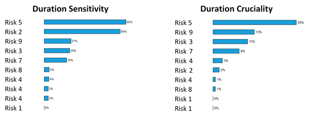
Four different rankings are compared with each other, including risk scoring (fig.1), the two different tornado graphs (fig. 2) and the proposed new method that measures the impact of the risk of the project's lead time.
New method to determine top risks
The new method to measure the impact of the risk on the project duration is actually very simple. First the risk analysis is carried out with all risks included. Then the analysis is performed again, but now with a single risk excluded. The difference in average project duration gives the time impact of the risk. In formula language this gives:

This analysis needs to be performed for each risk. By plotting the calculated impacts in Excel, for example in a bar chart, an intuitive and quantitative estimate is created of the top risks (Fig. 3). In contrast to the percentages of duration sensitivity and cruciality, the proposed method is quantitative in number of days.
The new method takes more time than the old method, which would have been insurmountable a decade ago. With the current fast computers, this is no longer a problem. If, however, a very large risk register is used, an interim solution could be that the new method is applied after making a selection with the old methods [6].
Results for the different tornado diagrams
Table 1 compares the rankings of risks for three different methods of rankings with our proposed new method.
Method 1 is the non-quantitative method based on the risk scoring table from Fig. 1. The probability and impact on the duration of an activity is translated into a score. In the example project used in this blog, there are few parallel paths, so the risk scoring obtains a ranking close to the real impact on the duration of the entire project.
Method 2 is the ranking based on the duration sensitivity tornado chart (left in Fig. 2). Method 3 is based on the duration cruciality (right in Fig. 2). We see that the three methods identify all different top 5 risks and that in particular the order differs. For example in the duration cruciality ranking, a risk that has an impact of 7 days is considered to be more important than a risk that has 17 days of effect on the average duration of the project.
Conclusion: Use your own tornado diagram
Tornado diagrams are used to prioritize risks within schedule risk analysis. This blog briefly discussed how these charts can differ from each other. Also, the charts do not show the actual impact of the risk on the duration of a project. Our proposed method (Fig. 3) is more intuitive than the currently used charts. In contrast with the old methods, the new method gives the impact quantitatively. In this way, the Project Controls Engineer can add value to the project team with a clear result of the schedule risk analysis.

This chart provides immediate insight in the profit that the project team realizes when the risk would be removed. In this blog we conclude that this tornado diagram is more intuitive and actually more accurate to use than the tornado charts based on duration sensitivity or cruciality.
For this blog we talked to several people who work within Project Controls and have a lot of experience with carrying out Schedule Risk Analyses, namely Richard van Milt, Joost Penninx, Martijn Jongen, Stijn Van de Vonder, Dennis Breed, Tom Duffhues, Han Pekelharing, Mark Schenk and Michel Molenaar.
Footnotes
[1] The Project Planning Infrastructuur (PPI) methodology is being applied more and more, not only for infrastructure. See, for example, the regulation flood protection schemes where the PPI methodology is legally enforced: https://zoek.officielebekendma...
[2] Spearman's rank correlation coefficient or Pearson correlation coefficient are commonly used, but can give different results.
[3] We follow PRA here. According to others cruciality is defined as what we have called duration sensitivity.
[4] Time impact can be measured by taking the average duration of a project or for example, the p80 value. For the sake of convenience, in this blog we use the average project duration. Another factor that could be included as a time impact is the impact of a risk on the spread of the duration. These topics may be discussed in a subsequent post. For the clarity and readability of this blog we have maybe over simplified some definitions.
[5] We only included the impact time, and used the risk scoring as predefinied in the PRA example project.
[6] In the case of a project with many risks, a first estimate can be made of the time impact with a single run by applying the following formula:

Here the average duration risk is assumed to be the duration of the risk when it occurs. The Calendar factor is a factor that is determined by dividing the ratio of the normal calendar (7 days in a week) by the working calendar of the activity to which the risk is linked (for example 5 days).